When a visitor comes to your municipal website using a smartphone or tablet, how does it look? Is it easy to navigate and find essential information like meeting minutes and election forms? Unfortunately, some websites look good on a big PC screen but look like an incoherent jumble on small devices.
Heard the key phrase responsive vs mobile optimized? What exactly does it mean? When a visitor comes to your municipal website using a smartphone or tablet, how does it look?
Is it easy to navigate? Easy to find essential information like meeting minutes and election forms? Unfortunately, some websites look good on a big PC screen but look like an incoherent jumble on small devices. The growth of mobile-friendly websites means that municipal websites can't afford to remain unresponsive. In this post, we will emphasize how important responsive website design is for a municipality.
A website can provide various benefits to a municipality, from providing vital information to accepting online payments. However, there is no point in having a website if it isn’t easily accessible and interactive.
These days, residents want information on the go, and since mobile web access is rapidly becoming the norm for all websites, they also expect it from their municipality. In short, it’s never been more important for a website to be accessed by any kind of device. The good news is that designing mobile-friendly websites is easier than ever, and you should make sure your town benefits from these advances in mobile technology. Let’s unpack the responsive vs mobile optimized debate.
Statistics That Show the Importance of Mobile Websites
According to a 2023 report from DataReportal, the average user spends over 4 hours per day on their mobile device, and 85% of Americans own a smartphone. The amount of time spent on mobile phones is set to increase as smartphone prices continue to decline and technology improves.
This is a significant change from the days before smartphones became prevalent. This clearly demonstrates the importance of having a responsive municipal website.
Google Prefers Mobile-Friendly Websites
Furthermore, in the responsive vs mobile optimized debate it has to be mentioned that Google has also recognized the surge in mobile usage. In recent years, the search engine has updated its algorithms to prioritize mobile-friendly websites. In 2020, Google switched to mobile-first indexing, meaning the mobile version of a website is considered the primary version.
Websites that are not mobile-friendly risk lower rankings in search results, making it harder for users to find them. According to Google's criteria, a web page is considered mobile-friendly if it:
- Uses text that is readable without zooming
- Avoids software that is uncommon on mobile devices, like Flash
- Sizes content to the screen so users don’t have to scroll horizontally or zoom
- Places links far enough apart so that the correct one can be easily tapped with a finger
Even if your site doesn’t rely on mobile search traffic from Google, improving your mobile site’s performance is beneficial – your residents will definitely appreciate it.
Is it Enough to be Mobile-Friendly?
The short answer is no. Although mobile-friendly websites are much better than old websites, they just don’t cut it in this day and age when responsive websites are becoming the norm. Beyond any other goal, a mobile web experience must be lightning fast and navigable. Delivering a fast, usable, and compatible experience to all mobile devices has always been a challenge, and it’s no different when you are implementing a responsive technique.
Did you know that 33% of internet users expect a mobile site to load as fast or faster than their desktop? First impressions are vital, and if your website loads quickly, you’ve instantly made a good impression. Unfortunately, a slow website makes us think it’s unsafe, insecure, and untrustworthy – a negative first impression that’s difficult to change.
In 2023, Google reported that 53% of visits to mobile sites are abandoned if a page takes longer than 3 seconds to load. Conversely, sites that loaded within 5 seconds had 70% longer viewing sessions and 35% lower bounce rates. People on the move are clearly even more impatient to get the answers they seek!
Mobile-Friendly Vs Mobile Responsive Vs Adaptive
Mobile-friendly sites are versions of sites that work across different devices but aren’t necessarily designed for a mobile device. They are mobile-optimized, but mobile-responsive sites take it a step further and put mobile devices first. Mobile-responsive sites are reliant on mobile operating systems and have dynamic content that adapts depending on where it’s viewed.
A mobile-friendly website will just make the content fit the screen without having to scroll, whereas a responsive site will choose a new layout that better responds to the mobile format. This process is automatic; the site checks for the available space and then presents itself in the ideal arrangement.
We have written about responsive web design before and shared details about how you can test to see if your own website is responsive. Every responsive site is mobile-friendly, but not every mobile site is responsive. Adaptive websites are similar to responsive websites in all but one important respect.
While responsive sites adjust to any layout, adaptive sites only adapt at select points where it will fit into place flawlessly. Responsive designs respond to changes in browser width by adjusting the placement of design elements to fit in the available space. An adaptive website has several different layouts, which can be deployed based on the size of the browser – usually comprising six designs for the most common screen widths between 320 and 1600 pixels. First, the site detects the available space, and then it selects the most suitable layout for the screen. Resizing the browser has no impact on the design. Companies that have embraced adaptive design include Amazon, USA Today, and Apple.
An Example of a Municipal Website That Hasn’t Been Mobile-Optimized
Many older municipal websites are not mobile-friendly. For example, the Town of Apple River, WI, is currently having their website upgraded.

As you can see, the clickable elements are not well spaced, making touch screen interaction frustrating. The viewport is not set, meaning its default is set to fit a desktop screen! Setting a viewport gives control over the page's width and scaling on different devices, and in this case, the lack of viewport means the content is too wide for the narrow mobile screen.
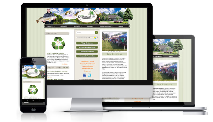
Town Web’s Responsive Design

In the responsive vs mobile optimized debate, it's important to discuss this with your website provider. Town Web prefers responsive municipal website design over all others because it is straightforward and fluid, so that users can access websites on any size and type of browser.
This is a much better option than designing multiple versions of your website for different devices. It’s also the best solution for the long term because the site will render correctly no matter how browser sizes change with different hardware devices in the future. It is also better in terms of user experience. Responsive vs mobile optimized also means, when responsive, mobile users should be able to do and see everything that desktop viewers can.
Additionally, Search Engine Optimization (SEO) benefits from mobile responsive design because any links that are shared will be displayed correctly no matter what device they are viewed on. The main features of responsive design include:
- Dynamic content that changes
- Condensed navigation
- Optimized images that quickly scale to fit all screen sizes
- Correct padding and spacing so that nothing feels too crowded or misaligned
- Reliant on mobile operating systems to function
This ongoing discussion of responsive vs mobile optimized is sure to develop as technology does. Town Web’s websites are always adaptable and friendly with any device (desktop, mobile, tablet, etc). If you are striving to improve and increase the usage of your municipal website for mobile users, we can help!
Request a free quote now.